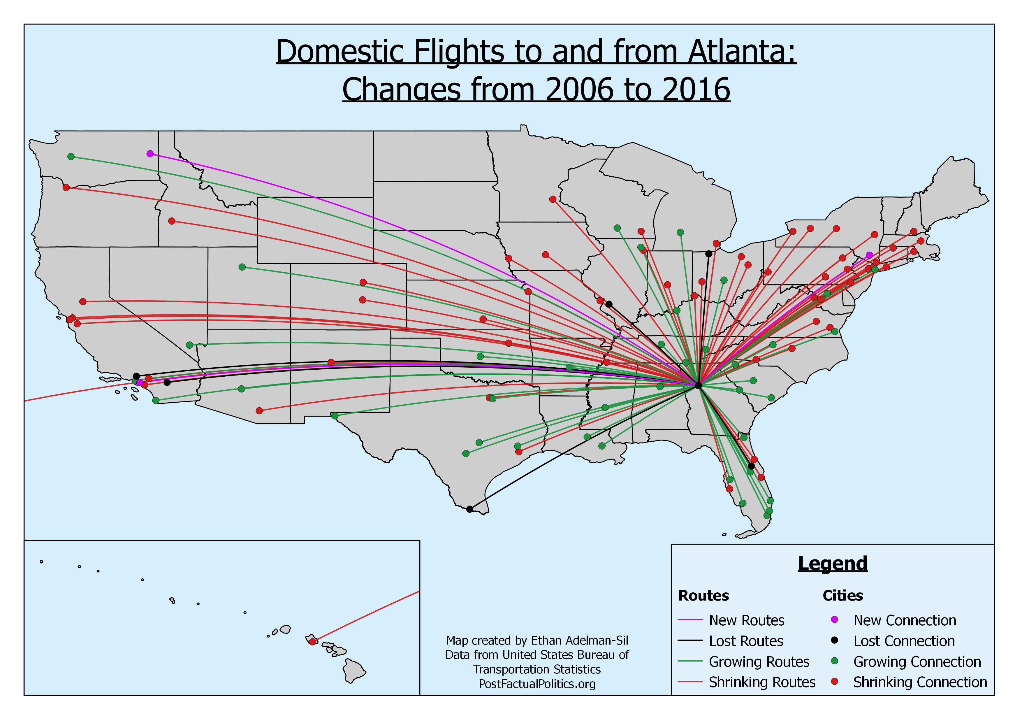
My last post was about changes in flight patterns from Atlanta to the rest of the United States. As these things can be a bit abstract, I took a break from my other projects (more on that at a later date) and made a map. It shows all of the direct flight routes between ATL and airports in the hundred largest metropolitan areas in the US.
Red routes had fewer flights in 2016 than they did in 2006, while green routes have more flights in 2016 than they did ten years prior. Black routes have been discontinued in the last decade and purple routes have been added. To make it a little easier, I made the color of the airports/cities (displayed as dots) correspond to the change experienced by the route.